Why I put numbers in my art
I think a lot about climate change. Don’t you?
We all know, or should know, that climate change is wreaking destruction on our environment. This is just one way in which humans are damaging the environment that sustains us.
I have been thinking for some years about how to register this concern in my art, without making my work negative. Because I still want to celebrate my own love of nature, and how I interact with it. The patterns I see that I want to share. The sense of being in a cathedral of trees when I am in the forest. The rooted feeling one has when a bare foot connects with a rock that has been here for millennia, and will be here for millennia after I am long gone.
When I started to look into carbon measurement, this seemed like the essential core of the issue.

“Field and Barn 419.13” Mixed Media on Cradled Wood Panel, 24 x 24”
i found another clue because of a glacier
I found another clue when I learned that Icelanders had held a funeral for a dying glacier. Ok, the short name for the Okjökull glacier in Iceland, had shrunk so much that it no longer qualified as a glacier. It was just some ice and snow. So in 2019, a funeral was held to mark the disappearance, and this plaque was unveiled. The inscription says:
Ok is the first Icelandic glacier to lose its status as a glacier. In the next 200 years all our glaciers are expected to follow the same path. This monument is to acknowledge that we know what is happening and what needs to be done. Only you know if we did it. August 2019. 415 ppm CO2
This was a very compelling statement. Compelling and moving. A glacier that had probably existed since the last Ice Age was gone. I had seen Canadian glaciers receding, and it’s not hard to imagine them sharing this fate. Glaciers I had hiked on as a kid. Glaciers I had marvelled at, so big they swallowed whole valleys between mountains.
I went looking for climate data
One of the organizations that monitors climate indicators is NOAA, the National Oceanic and Atmospheric Administration, a branch of the US Government’s Department of Commerce. This group monitors trends in atmospheric carbon dioxide, by compiling records provided from multiple sources around the world.
NOAA uses monitoring data from a number of marine sites around the world, and develops an average number that represents the amount of carbon in the atmosphere. The actual number is “the number of molecules of carbon dioxide divided by the number of all molecules in air, including CO2 itself, after water vapor has been removed.” What you are left with is a quantity of carbon molecules as a part per million, or ppm — meaning how many carbon molecules in a million molecules of dry air.
The marine sites are used to get a global number that is not subject to the variations in urban environments. One of them is Mauna Loa, a high monitoring station in Hawaii. I can easily imagine that a large city such as Toronto, where I live, has much more pollution than the middle of the ocean. So if you want a global number, you need to look at more isolated places. This makes sense to me.
There is much more information on the NOAA site, but basically they science the heck out of this thing to try to get an index that makes sense and is as accurate as possible.
For the painting you see at the top of this post, I used the data point for October 2022, which was when I was walking in this area and took a bunch of photo reference that I later used in my studio. 419.13 was the PPM in the atmosphere that month, averaged over all the global sites.
The numbers I am using are fairly recent, meaning they are subject to revision (past 12 months can be revised.) Also it has taken me a little while to understand which numbers I should be using. If you look at the graph below, you can see that there is a fairly significant seasonal variation in the number. At first, I was using the unadjusted number for a given month. Then I realized the number I really want is the seasonally averaged trend line. Global trend is the number I look for now — that’s the straight line in the middle of the graph below.
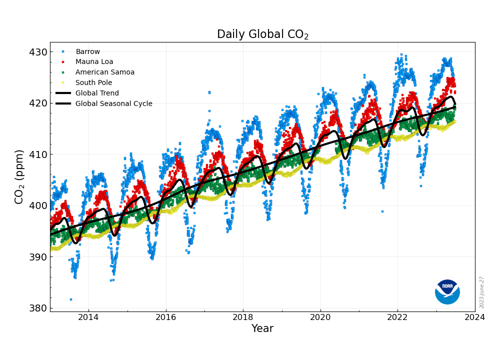
From the NOAA web site: The figure shows daily averaged CO2 from four GML Atmospheric Baseline observatories; Barrow, Alaska (in blue), Mauna Loa, Hawaii (in red), American Samoa (in green), and South Pole, Antarctica (in yellow). The thick black lines represent the average of the smoothed seasonal curves and the smoothed, de-seasonalized curves for each of the records. These lines are a very good estimate of the global average levels of CO2.
The least I can do is not look away
Of course, the issue here is not which number I am using. I trust the data these scientists are producing. I wanted a single trending number to work with. The issue that I want to bear witness to in my art is the rising trend. The number only climbs, and has been climbing for decades.
I say “bear witness” because I feel as helpless about this issue as many other people do. We are grinding our way inexorably to a situation where the future of humanity, and of thousands (millions?) of other species is at risk.
The least I can do is not look away. The least I can do is bear witness.
Someday, I hope the numbers I am painting start to go down. Or at least flatten out. But we are a long way from there. So I celebrate a landscape and a relationship with nature that will no longer exist in the future.
I don’t want my art to make people depressed. But I do want us to collectively take the steps we need to take to save ourselves. I love the forest, I love the birds, the trees, the wildflowers, the creatures of all sizes, on land, in air, in the water that sparkles in the sunlight and the moonlight. So I capture this love and this worry in one painting.